


Whitworth University Guest Parking System
ANALYZING CURRENT ISSUES & DESIGNING A BETTER VISITOR PARKING EXPERIENCE
For this project, my teammate and I followed a Human-Centered Design process to investigate challenges in Whitworth University’s current guest parking system and to propose a solution that improves communication, navigation, and the user experience.
Rather than assuming the problem was simply a lack of parking spaces, we focused on understanding visitor behaviors, identifying communication gaps, and designing with actual user needs in mind.
YEAR
DURATION
Role
2025
3 Weeks
UX Design
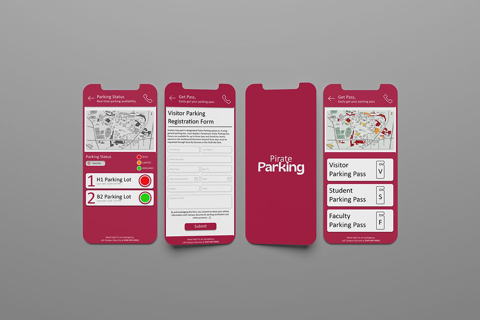
Whitworth University Guest Parking System
THE PROBLEM
Whitworth University provides visitor parking across campus, but many visitors struggle to understand where to park and how the temporary permit process works.
Current visitor flow:
-
Park Vehicle
-
Walk to HUB Information Desk
-
Request Visitor Permit
-
Complete Paper Form
-
Return to Vehicle
-
Display Permit
Through research, we found several problems:
-
Visitors did not know where visitor parking lots were located.
-
Visitors were unfamiliar with the location of the HUB and information desk.
-
Many visitors did not know that temporary permits were required.
-
Visitors needed to walk back and forth unnecessarily.
-
Security relied on manual verification using paper permits.
These issues created frustration, delays, and additional work for both visitors and staff.
Whitworth University Guest Parking System
THE CONTRIBUTION
For this project, I worked as both a UX researcher and designer.
My responsibilities included:
-
Conducting user interviews
-
Organizing findings through work activity notes
-
Building user personas
-
Creating design concepts
-
Designing wireframes
-
Developing a high-fidelity prototype in Figma
-
Conducting usability evaluation
Empathize
RESEARCH PROCESS
To understand the visitor parking experience, we collected data from three stakeholder groups:
-
Current Whitworth students
-
Campus visitors
-
Facility and security staff
We used:
Interviews
To understand personal experiences, frustrations, and expectations.
On-Site Observation
To observe visitor movement and identify points of confusion.
Card Sorting
To organize interview findings and identify recurring patterns.
After analyzing interviews and observations, several patterns appeared.
The current permit process creates unnecessary effort
Visitors had to walk multiple times between their vehicle and the permit office.
Visitors experienced navigation anxiety
Many visitors were unsure where visitor parking was located and often did not know where the HUB was.
Communication was inconsistent
Some visitors were not informed that permits were required before arriving.
Security lacked efficient tracking tools
Staff relied heavily on physical permits and manual monitoring.
Empathize
USER PERSONA
To keep the project grounded in user needs, I created personas representing key stakeholders.

Daytime Visitor (Guest Speaker)
Ethan McNally
Ethan was invited to campus for a STEM day afternoon event. He is anxious about parking situation as he is not familiar with the campus layout or parking rules,
GOALS
-
Find parking zone quickly
-
Arrive to the event on time
-
Know whether he needs a guest pass
FRUSTRATIONS
-
Unclear whether a guest parking pass is required
-
No clear indicators of where guest parking areas are
-
Took longer than expected to locate acceptable parking

Residential Student
Mai Smith
Mai is a senior living in on-campus housing. She usually relies on the student parking lot near her dorm so she can get to class quickly.
GOALS
-
Find parking quickly
-
Arrive Class on time
-
Access to student-designated parking
FRUSTRATIONS
-
Visitors parking in student spots during events
-
High campus activity days make parking unpredictable
-
Being late to class because she couldn’t find any open student spaces
DEFINE
FLOW MODEL
-
Event Coordinator: Responsible for issuing Temporary Parking Passes to visitors and assisting them with any related questions.
-
Security: Issues Temporary Parking Passes to visitors, monitors vehicles in the parking areas, and contacts visitors if needed for safety or verification.
-
Hub Info Desk: Provides Temporary Parking Passes to visitors and records visitor information to maintain accurate parking records.
-
Visitors: Park in the designated parking areas and may request Temporary Parking Passes or ask questions of the Event Coordinator, Security, or Hub Info Desk as needed.

DEFINE
PROBLEM STATEMENT
After collecting data, I organized interview findings into Work Activity Notes using card sorting to identify recurring patterns.
This process helped reveal communication breakdowns, unnecessary user effort, and opportunities for system improvement.
Visitors at Whitworth University experience confusion and unnecessary physical effort because the current temporary permit process depends on manual communication and physical permit collection.
Visitors Need:
-
Clear parking instructions
-
Easier permit access
-
Navigation support

How might we reduce friction in Whitworth’s guest parking process while improving communication and accessibility?
Ideate
DESIGN DIRECTION
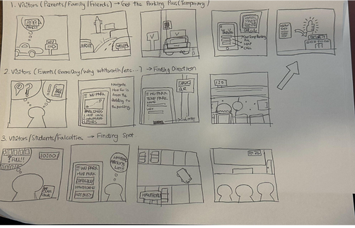
Based on research findings, we explored concepts that reduce physical effort and simplify visitor interactions.
We focused on combining permit management and navigation into one experience.
IDEATE
ECOLOGICAL DESIGN
Align with existing campus systems
Reduce physical searching effort
Reflect real parking availability

IDEATE
INTERACTION DESIGN
Simple workflow
Consistent navigation
Clear visual hierarchy
IDEATE
EMOTIONAL DESIGN
Reduce parking anxiety
Build familiarity using Whitworth branding
Increase confidence and sense of control
IDEATE
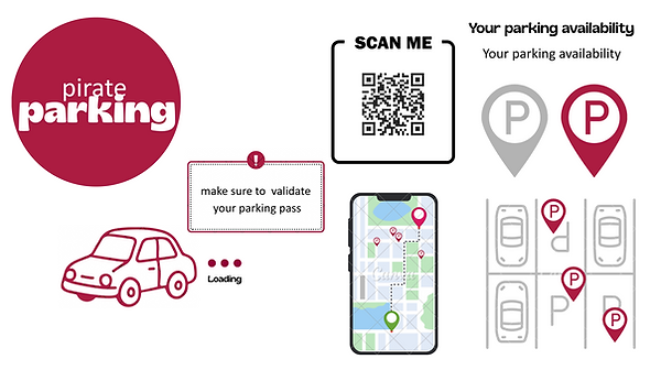
MOODBOARD
IDEATE
TYPOGRAPHY & COLORS
REBORN
ABCDEFGHI abcdefghi
BLACK
#000000
CRIMSON
#ACIC41
WHITE
#FFFFFF
Prototype
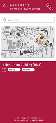
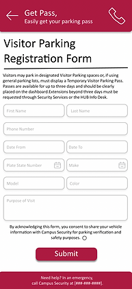
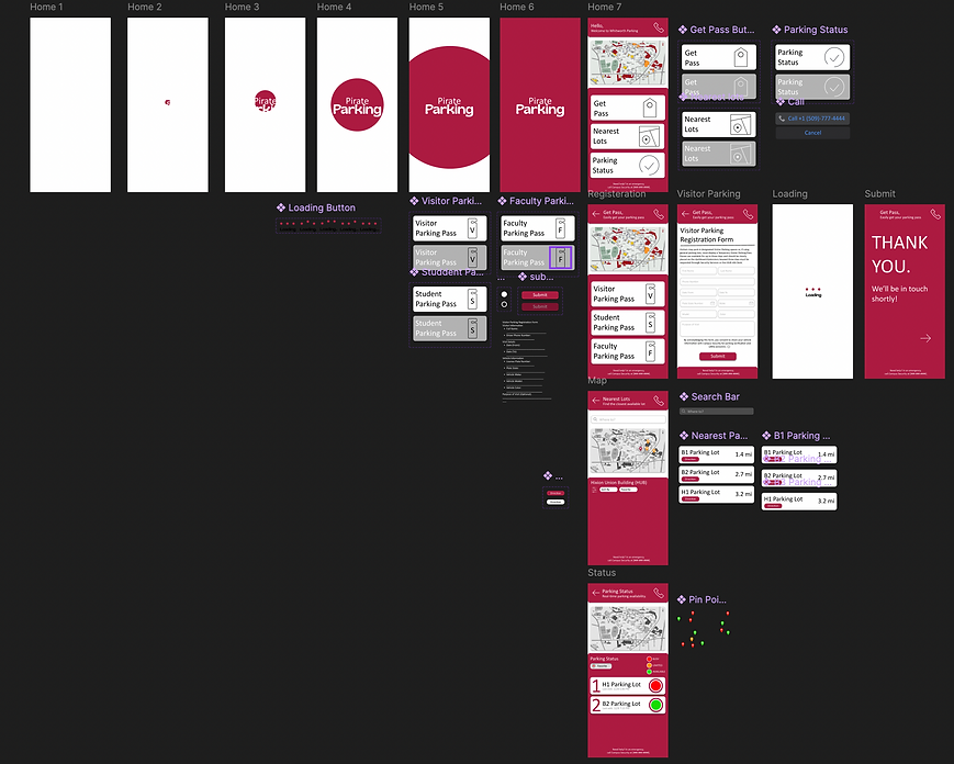
PROTOTYPE FEATURES
After defining the final concept, I translated ideas into wireframes and interactive prototypes.
The experience was designed to reduce cognitive load while helping visitors move through the parking process more confidently.
Core Experience:
Permit
-
Nearest Parking Lot
-
Availability
-
Navigation
Digital Permit Registration
Visitors can provide vehicle information before arrival.
Interactive Parking Map
Helps users locate visitor parking quickly.
Availability Indicators
Displays parking conditions visually.
Simple Workflow
Reduces unnecessary walking and repeated actions.
Tools
-
Figma
-
Canva





Test
UX EVALUATION
To evaluate usability, participants interacted with the prototype and shared feedback.
Both analytical and empirical evaluations were conducted.
ANALYTICAL EVALUATION
We performed an analysis of the primary tasks, such as validating temporary parking permits, navigating the campus map, and checking parking availability to perform an analytical evaluation:
Strength:
-
Easy to operate
-
Makes the user feel calm by using a familiar color from Whitworth design guidance
-
User needs are well understood by giving solution
Areas of Improvements/consideration:
-
Notifications about nearby construction could help keep users informed about expected traffic near campus (ex) hawthorne rd construction
-
Notifications about expected parking conditions, such as alerts for upcoming campus events, could be useful for both students and visitors
-
Fonts could also follow the official Whitworth design guidelines to ensure consistency.
-
The page flows a bit awkwardly. For a better user experience, a better flow in rendering pages is required.
EMPIRICAL EVALUATION
To perform the empirical evaluation, data elicitation interview participants interacted with our prototype and provided the following feedback:
Strength:
-
Easy to navigate: users are not challenged to operate applications.
-
Ease users’ anxiety and frustration with guest parking.
-
Real integration to ease physical effort.
-
Clear design without requiring affordance training.
Areas of Improvement:
-
Enhancing the sense of welcome for users.
-
Improving the visibility and clarity of accessible (disabled) parking spots.
-
Adding a clear explanation page for general parking rules.
Whitworth University Guest Parking System
REFLECTION
This project taught me that parking issues are not always caused by physical space limitations.
Through research, I discovered that communication, information accessibility, and service design can significantly impact how users experience an environment.
This project strengthened my ability to combine UX research, systems thinking, and visual design to create solutions that support both operational needs and human experiences.
