top of page
Create Your First Project
Start adding your projects to your portfolio. Click on "Manage Projects" to get started
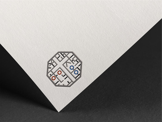
Korean Presbyterian Church of Spokane Branding
I have incorporated the identity of Spokane Korean Presbyterian Church with traditional Korean design elements. Using the Taegeuk symbol, "Korean" is represented by yang (red), while "Presbyterian Church" is represented by yin (blue). Additionally, 18 elements of Geon, Gon, Gam, and Ri are included to emphasize Korean harmony. Through this, I aimed to clearly express that Spokane Korean Presbyterian Church is not just an ordinary church in the U.S. but a distinctly Korean church. Furthermore, beyond the traditional cross symbol, the design conveys the church's role in contributing to and helping the local community in Spokane.
bottom of page


